Creating a beautifully designed home goes far beyond choosing stylish furniture. The real magic of interior design lies in how color, texture, and contrast work together to create a cohesive, visually engaging, and comfortable space. When balanced correctly, these three elements elevate an ordinary room into a personal sanctuary that reflects your unique style.
This comprehensive guide explores how to combine color palettes, introduce varied textures, and use contrast to craft interiors that feel harmonious, inviting, and timeless.
Why Color, Texture, and Contrast Matter
Color influences mood, texture adds depth and warmth, and contrast brings energy and definition. Together, they create:
Visual Balance: Preventing rooms from feeling flat or chaotic.
Emotional Impact: Evoking calm, excitement, or sophistication.
Functional Zoning: Guiding movement and highlighting key features.
Neglecting any of these elements can result in a space that feels unfinished or overwhelming.
Mastering Color: The Foundation of Interior Harmony
Color sets the emotional tone of a room and can dramatically alter the perception of size, light, and mood.
1. Understand the Color Wheel
Familiarize yourself with primary, secondary, and tertiary colors, as well as relationships such as complementary (opposites) and analogous (neighbors). These relationships guide you in building harmonious palettes.
2. Choose a Dominant Color
Start with one main hue—often a neutral like white, beige, or gray—to anchor the design. Use this as the background for walls and large furniture pieces.
3. Add Accent Colors
Select 1–2 accent colors for vibrancy. For example:
Navy blue with mustard yellow for a modern twist.
Soft sage with dusty rose for a serene vibe.
4. Follow the 60-30-10 Rule
A classic guideline for balance:
60% dominant color (walls, large furniture)
30% secondary color (upholstery, curtains)
10% accent color (pillows, art)
5. Consider Lighting
Natural and artificial light can dramatically shift how colors appear. Always test paint swatches at different times of day before committing.
The Role of Texture: Adding Depth and Comfort
While color engages the eye, texture engages the sense of touch, adding richness and warmth.
1. Mix Materials
Combine smooth and rough surfaces—such as sleek marble countertops with rustic wood beams—for a layered look.
2. Use Textiles
Incorporate a variety of fabrics:
Soft textures: Velvet pillows, wool throws.
Crisp textures: Linen curtains, cotton upholstery.
3. Play with Natural Elements
Add organic textures like stone, jute, or wicker to create an earthy, grounded atmosphere.
4. Create Visual Texture
Patterns like herringbone wood floors or woven wallpaper add depth even when the surface is smooth.
5. Balance Is Key
Too many rough textures can feel heavy, while too many glossy finishes can seem sterile. Aim for a thoughtful mix.
Harnessing Contrast: The Spark of Interest
Contrast gives a room dimension and prevents monotony. It’s the element that makes your design pop.
1. Light vs. Dark
Pairing dark walls with light furniture, or vice versa, draws the eye and creates drama.
2. Warm vs. Cool
Combine warm wood tones with cool blues or grays for dynamic balance.
3. Old vs. New
Blend antique furniture with modern lighting fixtures for eclectic charm.
4. Matte vs. Glossy
Use shiny tiles alongside matte cabinetry for a subtle yet striking effect.
5. Scale and Proportion
Contrast large, bold furniture pieces with delicate accents to create rhythm.
Practical Tips for Achieving Interior Harmony
Start with Inspiration Boards
Collect images from magazines, Pinterest, or design blogs. Identify common threads in color, texture, and contrast.
Sample Before You Commit
Order fabric swatches, paint samples, and flooring materials to see how they interact under your home’s lighting.
Use Layers
Think in layers: base (walls/floor), mid-layer (furniture), and top layer (accessories). Each layer should incorporate varied textures and contrasting elements.
Don’t Forget the Ceiling
Often called the “fifth wall,” ceilings can introduce unexpected color or texture, such as exposed beams or patterned wallpaper.
Room-by-Room Strategies
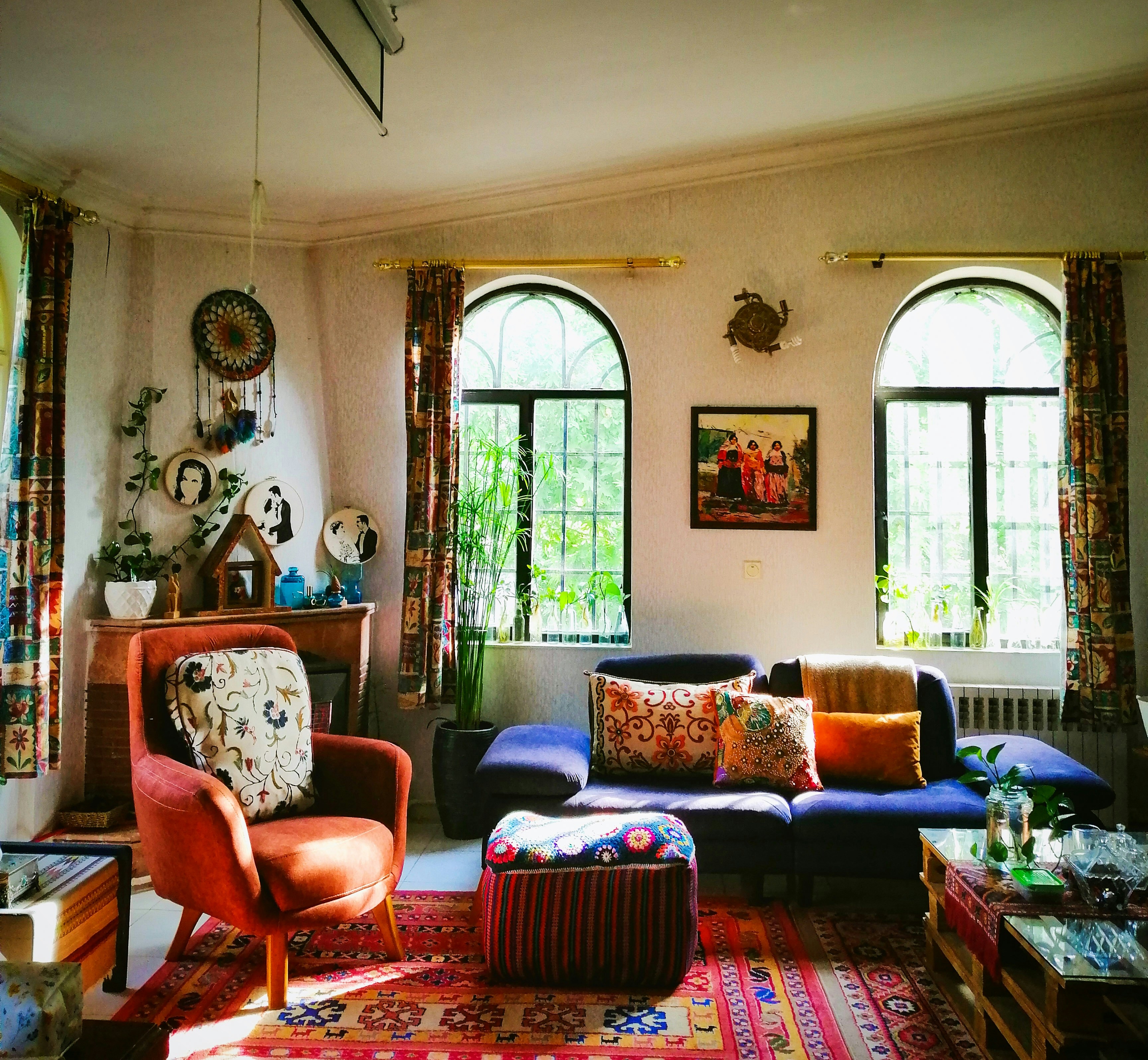
Living Room
Color: Choose a neutral foundation with bold accents—like teal pillows or a burnt-orange rug.
Texture: Add depth with a chunky knit throw and a mix of leather and linen upholstery.
Contrast: Pair a sleek glass coffee table with a reclaimed wood TV console.
Kitchen
Color: White cabinetry with black hardware provides crisp contrast.
Texture: Subway tile backsplash and butcher-block countertops create tactile interest.
Contrast: Matte-finish cabinetry alongside stainless-steel appliances balances modern and rustic.
Bedroom
Color: Soft, calming shades like dusty blue or lavender encourage relaxation.
Texture: Layer bedding with quilts, velvet cushions, and a plush rug.
Contrast: Dark wood bed frames pop against pale walls.
Bathroom
Color: Experiment with deep jewel tones or crisp monochromes.
Texture: Incorporate stone sinks, textured tiles, or woven baskets.
Contrast: Mix matte black fixtures with glossy white tile.
Common Mistakes to Avoid
Overloading with Patterns – Too many competing prints can overwhelm the eye.
Ignoring Lighting – Poor lighting can wash out colors and flatten textures.
Lack of Focal Point – Without a visual anchor, a room feels disjointed.
Playing It Too Safe – Neutral on neutral can appear bland; introduce pops of contrast.
Sustainable and Budget-Friendly Ideas
Repurpose Existing Furniture – Add texture with slipcovers or new hardware.
Eco-Friendly Materials – Choose organic cotton, bamboo, or recycled wood.
DIY Accent Walls – Paint geometric patterns or use removable wallpaper for low-cost contrast.
Final Thoughts
Mastering color, texture, and contrast is like conducting an orchestra—each element plays a vital role, but true beauty emerges only when they work together. Whether you’re refreshing a single room or redesigning an entire home, these principles will help you create interiors that are balanced, inviting, and uniquely yours.
By thoughtfully blending these design elements, you’ll transform your living spaces into timeless works of art that delight the senses and stand the test of time.


